Mokume-gane earrings tutorial

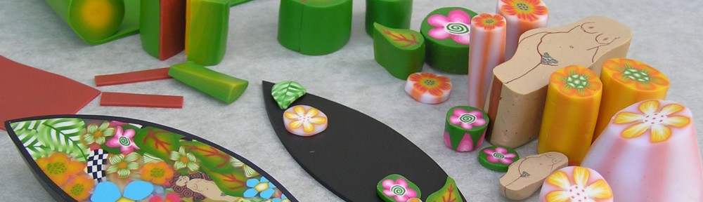
Mokume-gane using minimal tools

This information accompanies the post about using minimal tools, and the Mokume-gane post.

There is no paint or other materials used here – and the only tools are a hand roller, blade and knife (and some found items for making impressions).

The way I use this technique works just as well with, or without, a pasta machine.

The end result is usually unexpected – sometimes disappointing, at other times a lovely surprise.

Experiment with colours, the number of layers and the items you use to make impressions. This is what I did.

I rolled three colours to about the same thickness. I wanted the white, and particularly the black, to be thinner than the other colours, so I put a thin layer of black on the white then rolled them together. (I think I used a total of about 60g of clay, the equivalent of a small pack of clay, and this will make a lot of pattern).

Next I stacked the four sheets. It doesn’t matter if the edges aren’t even, you can tear some of your sheets and fill in gaps so that most of your stack has the four sheets.

Rolll out thinner, then cut in half and stack again. You’ll have ten layers. Roll out again, cut in half and stack once more, again tearing some pieces to even the stack. You’ll have twenty layers. I generally like to have between 15 and 30.

I roll this out to a thickness of about 4mm – about 1/8 inch – but try thicker or thinner for different effects.

I then make impressions on the stack. I used the items in the pic above. Make the impressions fairly deep.

Take a clean blade, slightly bend it and take the thinnest slices that you can from the top. You could practice on some plain clay first. As well as pulling the blade towards me, I moved it slightly from side to side. It can help to use your little fingers for support by placing them on your work surface while you slice. I would usually try for a bit more contrast in impressions, for example use the back of a knife in one area, and more rounded objects in another. See one example.

Place the thin slices on a plain sheet of clay. You can create your pieces from this sheet, and also from what remains of the original stack.

Making earrings

You can flatten the sheets in a few ways. You can simply roll over with your roller, using some pressure. This is effective particularly where the sheet is very uneven. Alternatively, you can put deli paper, freezer paper or plain paper over the work, and press your fingers, or the back of a spoon, in a circular motion. You may need to use some pressure, but this will work if the piece isn’t very uneven (for example the green piece on the left.

Once the sheet has a flat, even surface, I draw and cut out shapes from paper. I keep a collection of favourite shapes by covering thin card with contact (or book cover) and cut the shape out with a blade.

I find a place where I want to cut the shape out, then put the shape down in that spot and cut out carefully with a craft knife. This takes a bit of practice, so try on some plain polymer clay first.

Once cut out you can put a hole in the top with a needle (so you can put in a jump ring later). Twist the needle gently or you may split the piece. You can also bake as is, and make a hole later with a hand drill. Alternatively, using an idea from https://www.instagram.com/lindlyhaunani/# I use plastic covered paper clips which I have cut off with wire cutters. The plastic seems to melt with the clay and the attachment is firm. I gently make two holes with a very fine needle, twisting as I go, then a slightly larger needle. I then gently push the piece of paper clip in. I have the earrings on a tile to make this easier – if you need to touch the earring put a piece of paper over the top.

For these earrings I’ve pushed some course sandpaper in to make a texture. Test first on your scraps. If that’s going to stick put a small amount of cornflour on your piece before using the sand paper. It will wash off after it’s baked.

Bake at the recommended temperature. I usually bake everything for an hour.

Making the neck piece.

Start with a lump of scrap clay. Roll into a ball then insert wooden skewer (or similar). Start gently rolling. Take care not to make the hole in the middle too big. If it’s getting large, just take the skewer out, squeeze it in a bit and roll for a bit without the skewer. You can control the length. If you move your two hands closer together while rolling, you will make it shorter. If you aim your hands apart as you roll, the log will get longer. I wanted to cover the scrap with some colours which would show through any gaps. I used different colours to give the piece some variation. Roll until smooth, moving hands towards each other to stop it becoming too long. Take the pieces you sliced off your stack and place them all over the log. Once again, roll this to smooth it out.

Once it is the right length, take the skewer out and gently shape into a “U” shape. Once baked, thread some buna or other cord through. I smoothed mine more after baking by sanding with wet and dry sandpaper using P400 then P600 – then buff it on an old pair of jeans to give it a bit of shine. (sandpaper grits can differ between countries so check out what grits are recommended in your country.)

Create a colour scheme – a simple approach.

Making your own colour scheme can enhance the individuality of your work. While you may want to learn a lot more about colour, you could find that the following approach can help you build your own cohesive colour scheme straight away.

Create a basic colour scheme

You will:

  • work with three packet colours only, plus black and white (believe me, this is easier that starting with more packet colours)
  • follow some basic steps to create a colour scheme without trying to match, or create, specific colours
  • make changes (if needed) to one or more colours until you’re satisfied.

Here are the steps I followed to get to the colours I used in the dish pictured above. Your initial scheme will have quite ‘clean’ colours, meaning no muted/muddy colours such as browns. However this is a good start for any scheme, and I explain below how to add some muddy colours to your scheme (such as brown, olive green, mustard yellow).

Step 1 – choose three packet ‘primary’ colours

Choose three packet clay colours that are exactly, or similar to, the three CYM primary colours.

The colours marked C Y and M below are the primaries, from which you can mix almost any colour (think about your inkjet printer with 3 colour tanks plus black). Three Premo colours are quite close to the primaries – cobalt blue, zinc yellow and fuchsia (marked below with *). However, any colours in any brand that are similar will work. The colour wheel gives some idea about the results of mixing any two of your colours together – so for example yellow and fuchsia will result in oranges or reds.

Step 2 – mix 2 packet colours

Take two of your three colours (let’s call them colour 1 and colour 2) and mix different proportions to create 2 or 3 new colours. Proportions are important. Try a 50/50 mix, then try 20 parts to 1, which will give you an idea of the strength of each colour. Think of the resulting colours as the main colour group for your scheme, although you can change this later.

Step 3 – mix contrast colours using the third packet

Make one or two colours by mixing just two colours at a time, but this time include the third colour – so mix colour 1 and 3, and colour 2 and 3. This should form some contrasts to your first set of colours. Alternatively you may want one of your contrast colours to be one of your packet colours (for example blue or yellow).

Step 4 – check for contrast and finish your colour scheme

Look at your new colours and see if there is enough contrast. It’s good to have some colours that are similar, but some contrast is important for a lot of polymer clay techniques. Consider:

  • hue – the actual colour, for example yellow and purple are a strong contrast
  • light/dark – imagine a black and white photo of your colours – would you see strong contrast
  • clean v muddy (muted) – are some colours ‘clean’ (eg a bright green) and other colours muddy (eg olive green, mustard or brown).
  • proportions – are you using different proportions of each colour in your work?
To lighten colours

You may want to lighten one or more colours to increase contrast. Generally you can do this by:

  • adding yellow to a colour that contains yellow (reds, oranges or greens) or
  • adding white to colours such as blues and purples.

Example

I used Premo cadmium yellow (CY), ultramarine (U and fuchsia (F). My first mixes were CY and U.

I mixed:

  • 50 parts CY to 1 part U
  • 12 parts CY to 1 part U
  • 3 parts CY to 1 partU

These are not recipes, but a guide to what you might expect. (Colours change a lot due to camera, lighting and computer screens)

Note how strong the U is compared to the CY. Using half and half would resu a very dark green. You can ‘eye ball’ your amounts, but I cover how to measure proportions below.

For my contrasts I mixed:

  • 1 part F to 4 parts CY
  • 1 part F to 8 parts CY
  • 4 parts F to 1 part U

After looking at the colours together, decided I needed another light colour. I mixed the purple colour with some white. Here is my colour scheme with black and white added, and showing how I might use different proportions in a piece. Colour schemes rarely look good if you just set out equal amounts of each colour. A general rule to start with is to use 60% of your main colour, 30% of your first contrast and 10% of your second contrast

Another example

For this scheme I started mixing magenta and yellow, resulting in a very light orange and a mid orange. My contrast colours were blue (cobalt blue packet colour third from the left) and magenta/purple. I decided to make blue the main colour, so I added white to the blue in different amounts to give me a range of blues, and made a darker blue by adding a small amount of black. I also included some white in the scheme. I’m not sure if the magenta/purple works, but it may look good if used in small amounts.

Key tips

  • See what colours develop rather than trying to match a particular colour scheme
  • Don’t start with more than three colours (+ black and white)
  • Once you have a colour scheme you like, stick with it for a while – you probably don’t need to mix a new scheme every time you make something
  • If you have a pasta machine or small scale you can measure and document your recipes
  • Some clay colours are very strong, so try using smaller amounts of the darker colour for example use 1 part blue to 20, 50 or even 100 parts yellow
  • Contrast – in most polymer clay work good contrast is important. Check to see if there’s enough contrast in your colours

Take your colour scheme further

If you started with the primaries, or very close to the primaries, your colours will tend to be pure (clean). This means the colours are bright and clear, so you won’t have very muted (or muddy) colours such as mustards, olives or browns.

I’m often happy with quite clean colours, particularly as techniques such as mokume gane can muddy up the colours when very thin layers blend in the process.

However, if you want to take your scheme further, this is how I worked my green/orange scheme above to create a more complex scheme, including more muted colours.

Step 1 – alter one or more colours

This part involves playing around altering one colour at a time to see what fits in. One slightly different colour can make a big difference to your scheme. I only changed two colours in the end, but I tested a few mixes before I was happy.

I decided I wanted to try some browny colours, and also add one or more light contrasts.

To mute (muddy) a colour, you can add a small amount of black. If that darkens the colour, add some white as well (using twice as much white as black can prevent darkening). However, I prefer to mix in a colour that is on the other side of the colour wheel – it doesn’t need to be exactly opposite. Note that two colours that are somewhat opposite on the colour wheel make a muted colour when mixed together. So I decided to aim for some browns by adding a little U to my original oranges. It only needed a small pinch to turn the orange to brown.

Step 2 – play around until you are happy with your new scheme

I decided that I liked the three colours in the right hand picture.

I made a much lighter orange by mixing 1F to 50 parts CY.

The mid brown and dark brown are both made by adding a small amount of U to my original oranges.

4CY, 1 F and 1 U (middle) and 8CY, 1F and 1/2 U (bottom).

After playing around with my new colour samples, I decided to keep the original greens and purples, but to replace the original oranges with the new lighter orange and dark brown. I usually use some black and white as well to my work, so I’ve included that.

If you alter the proportions in your work, the one colour scheme can look quite different. For example, the orange and brown could be the major colours, using greens and purples as minor contrasts.

Measuring and recording

You don’t need to measure your colour mixes exactly, and you can do some by eye (for example mixing 1/2 a packet of one colour with 1/4 packet of another. However, more accurate measurement can be important if mixing more extreme proportions (as below) and enable better record keeping if you want to record your recipes. Some options for more accurate mixing:

  • Roll packet colours to the same thickness (using a pasta machine). Use a cutter to measure amounts. Using all 12 yellow squares and the quarter of a blue square would give me 48 yellow to 1 blue.
  • Use a small scale – available cheap online. I have 0.51 (about half) a gram of blue. 24 gram of yellow would also give me 48 yellow to 1 blue.
  • Using some graph paper (preferably under a translucent surface). The mix in the picture would be about 96 yellow to 1 blue.

I make samples of all my colour mixes, and record the recipe on the tile. I then have a box of tiles to play with if I want to create a new scheme.

Colour resources

BreakThrough Colour – While not only for polymer clay artists, many members of Tracy Holmes’ Colour Room work with polymer clay. A great way to get more confident with colour.

Joan Tayler sells some colour resources that are specific to polymer clay on her Etsy site. Her colour lines show the range of colours you can achieve by mixing just two colours. Her instagram shows her ‘4 packet challenge’ where she made a scheme from 4 random packet colours.

The Blue Bottle Tree Insiders Community is a great resource for anything polymer clay, including articles and videos about colour.

Polymer clay basics

If you want to know more about polymer clay, or would like to try working with polymer clay, see the new tutorial section, which includes basic information about polymer clay and a tutorial for a simple flower cane.

polymer clay clock 2008

What I learned from Lindly

Beads made from the color blends I brought home from Lindly’s class

I did two workshops at CFCF 2012 with Lindly Haunani.  As is often the case, the biggest lesson for me had nothing to do with the actual workshop projects.

I spend lots of time developing a color theme, and then producing most of my work using that theme.   I love “Color Inspirations” by Lindly and Maggie Maggio, and I used some of the steps in the book to create the color theme I usually use.   So, walking into Lindly’s classes and being presented with 5 blocks of (donated) Premo filled me with anxiety. Black, white and 3 stark prime colors – something like this and no time to mix better ones. There was only one thing to do – Continue reading