There are so many different ways people develop a colour scheme for their work. I’m sharing my approach, which is a quick way to start, even if you have no understanding of the theory.
Why mix your own polymer clay colours?
I like to mix my own colours, rather than relying on packet colours. This enhances the individuality of my work and gives me an endless range of colours.
I use three packet colours plus black and white. I rarely use anything else.
Step 1
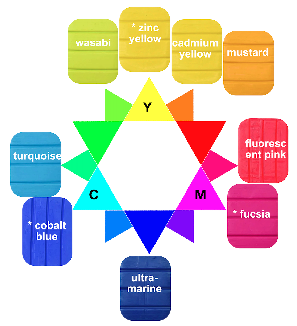
Choose three clay colours that are similar to the three CYM primary colours. Think of an inkjet printer that prints almost every colour with just three tanks – cyan, yellow and magenta.
The colours with an * below and the CYM primaries – in Premo the CYM primaries are cobalt blue, zinc yellow and fuchsia. However, this approach can be more effective if you choose other colours that are similar to the primaries.
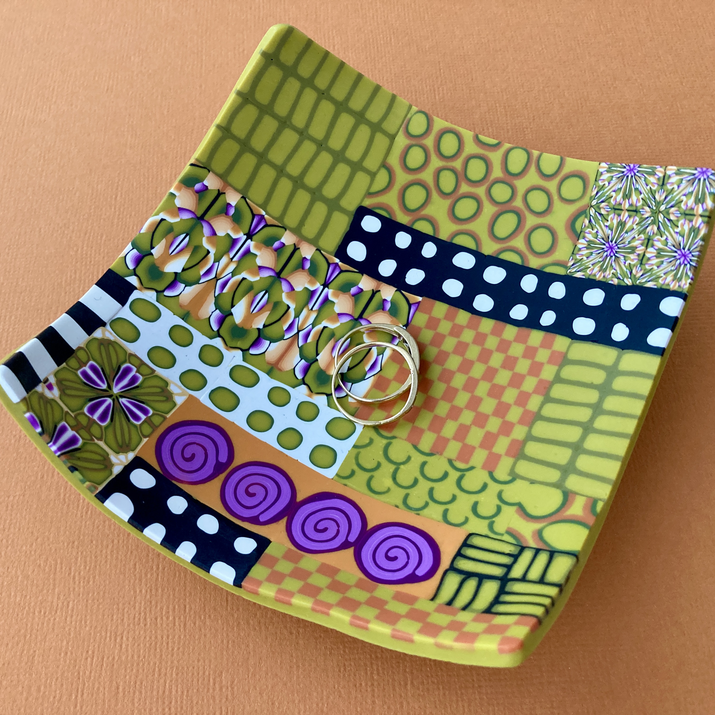
I use cadmium yellow, ultramarine and fuchsia (for example in the dish above). In the example scheme below uses mustard, ultramarine and fuchsia.
Step 2
Take two of these colours and mix different proportions to create 2 or 3 new colours. These will be your main colour group.

Here I mixed
- 16 mustard to 1 fuschia and
- 4 mustard to 1 fuschia
Step 3
Mix one or two colours with each of the other combinations. These will be your main contrast and second contrast. Here I mixed
- 20 mustard to 1 ultramarine,
- 4 mustard to 1 ultramarine and
- 15 parts fuschia to 1 part ultramarine.

Step 4
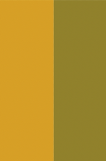
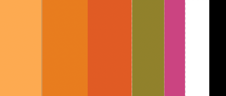
Look at your new colours and see if there is enough contrast (see below). I mixed the lighter orange colour with white to create one additional lighter colour. I also removed the mustard/green colour (the 20 mustard/ 1 ultramarine mix) because it wasn’t much of a contrast for the oranges.
I think I’d prefer a bit more contrast – which I think I would get if I used the yellow rather than the mustard. However, I think this is quite a cohesive scheme that gives many options where you might use just two of the colours, or all of them in a piece.
When looking at your new colours, imagine using about 60% of the main group, 30% of your first contrast and 10% of your second contrast. I’ve spaced mine out that way and added black and white.
My key tips
- See what colours develop rather than trying to match a colour you’ve seen
- Don’t start with more than three colours (+ black and white)
- Once you have a colour scheme you like, stick with it for a while – you probably don’t need to mix a new scheme every time you make something
- If you have a pasta machine or small scale you measure and document your recipes
- Some clay colours are very strong, so try using smaller amounts of the darker colour for example use 1 part blue to 20, 50 or even 100 parts yellow
- Contrast – in most polymer clay work good contrast is important. Check to see if there’s enough contrast in your colours.
Contrast
Use this as a contrast checklist:
- hue – the actual colour, for example yellow and purple are a strong contrast
- light/dark – imagine a black and white photo of your colours – would you see strong contrast
- clean v muddy (muted) – are some colours ‘clean’ (eg a bright green) and other colours muddy (eg olive green, mustard or brown)
- proportions – are you using different proportions of each colour in your work
